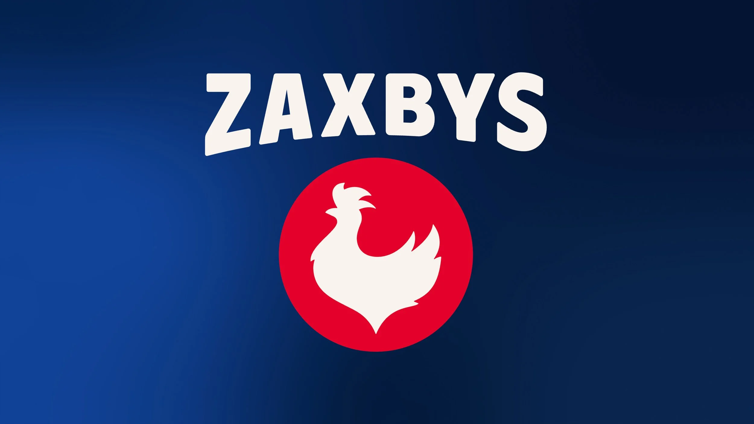
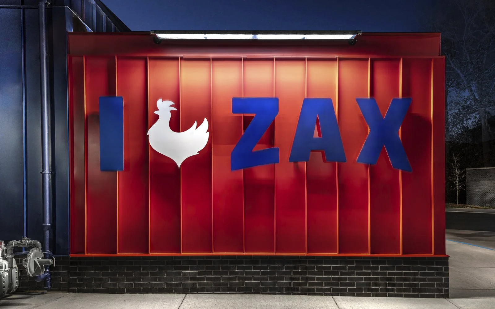
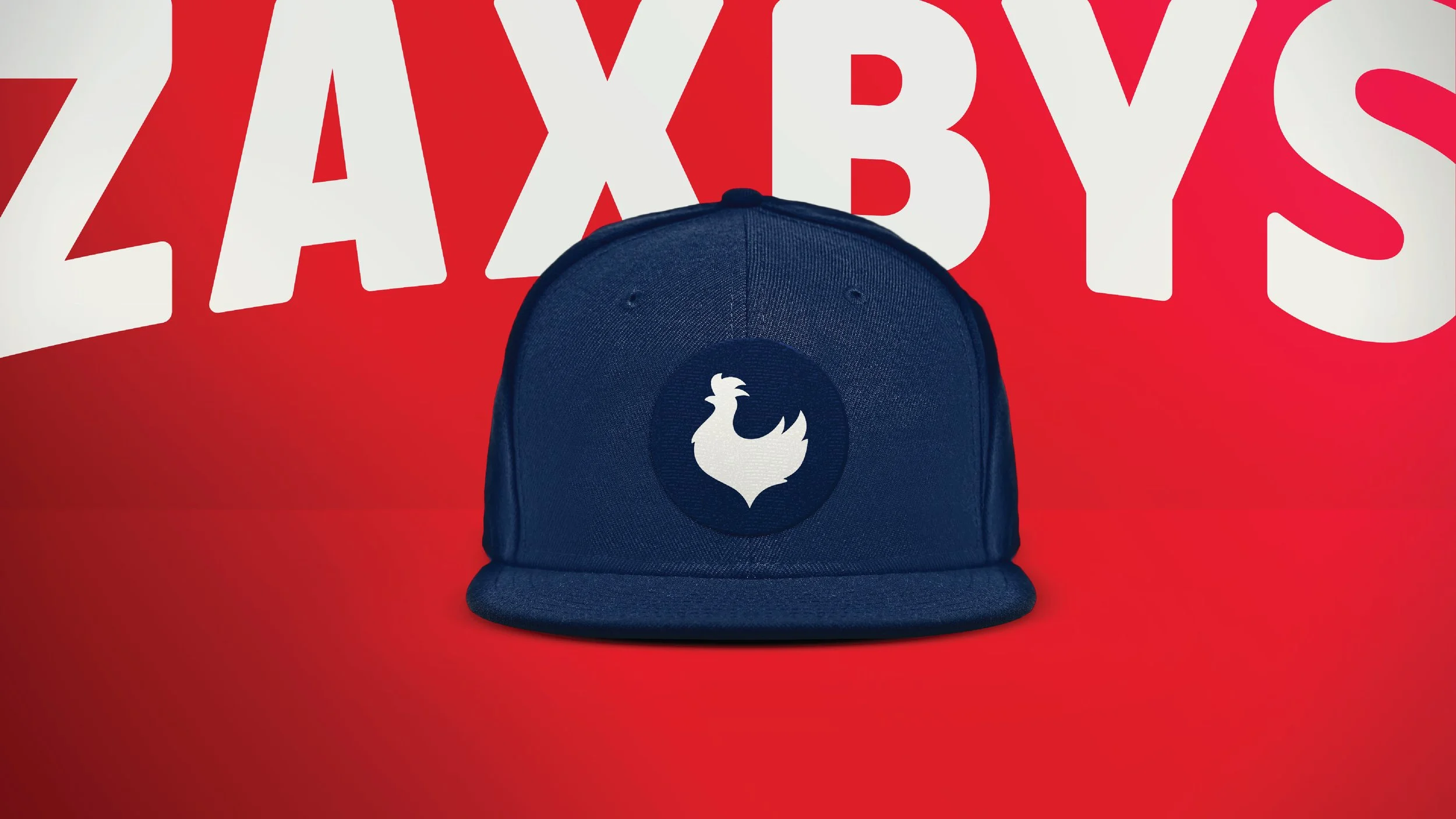
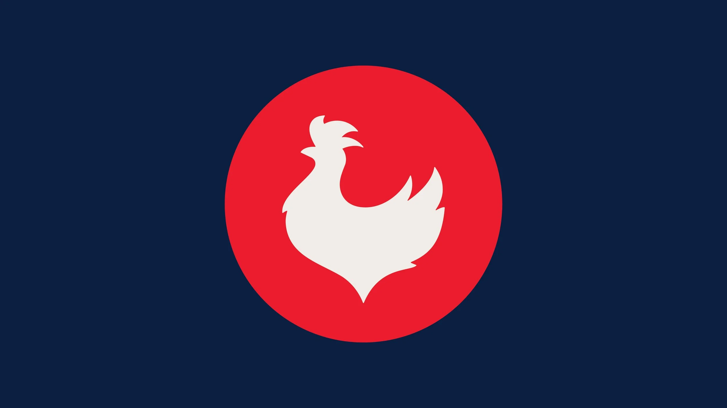
Zaxbys
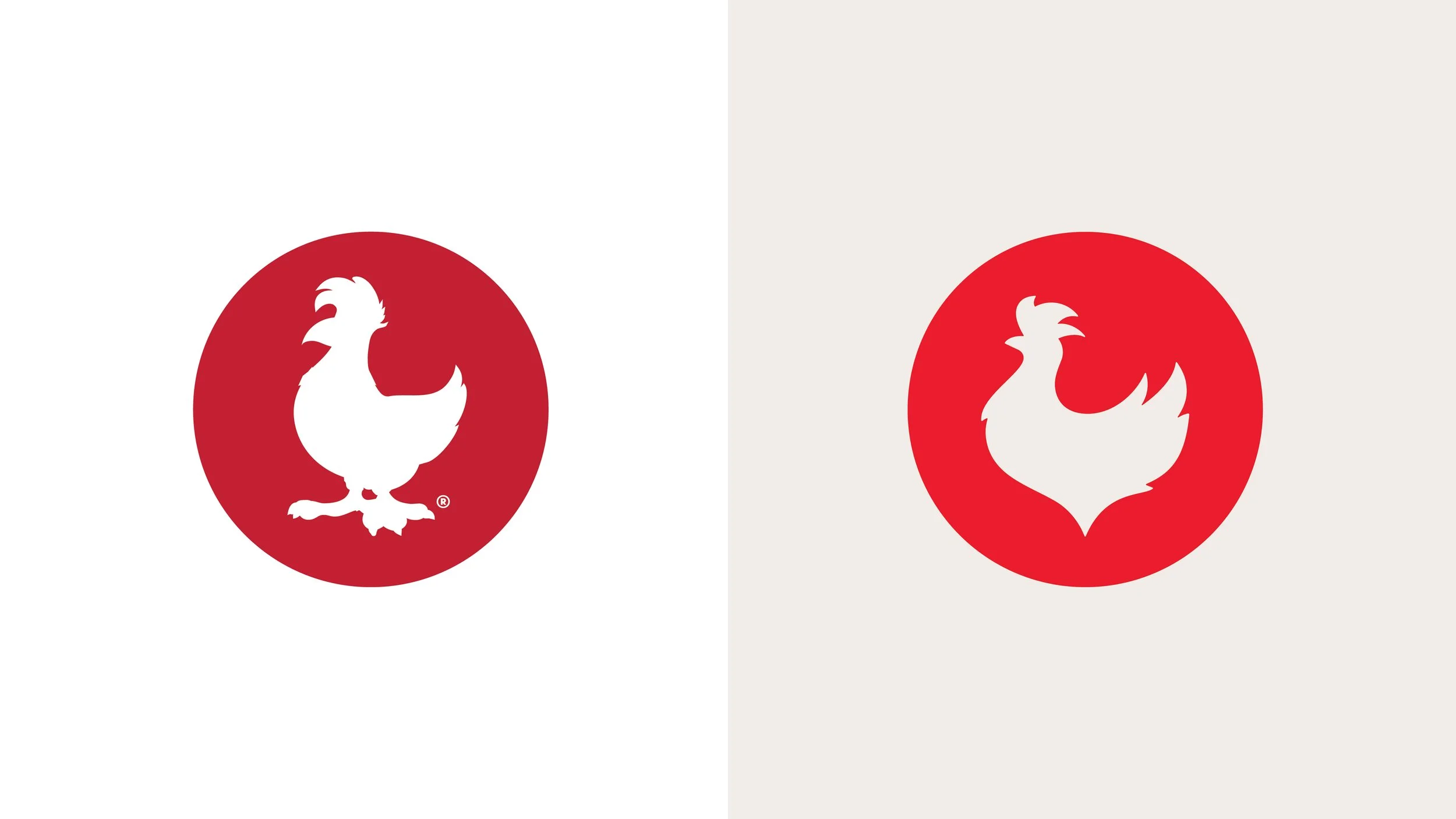
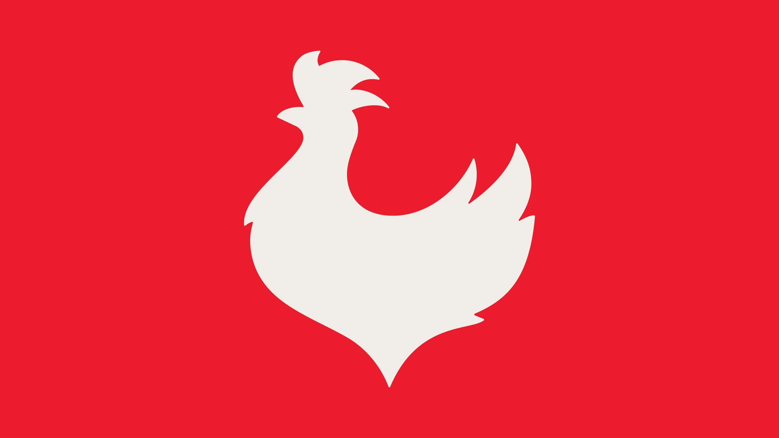
Zaxbys was looking to refresh their branding to stay competitive in a crowded chicken QSR landscape. We maintained their iconic visual elements — curved baseline and red circle — while modernising both the wordmark and the chicken icon to reflect the confidence and pride they have in their product.
This was a team project with my contribution being the new chicken icon